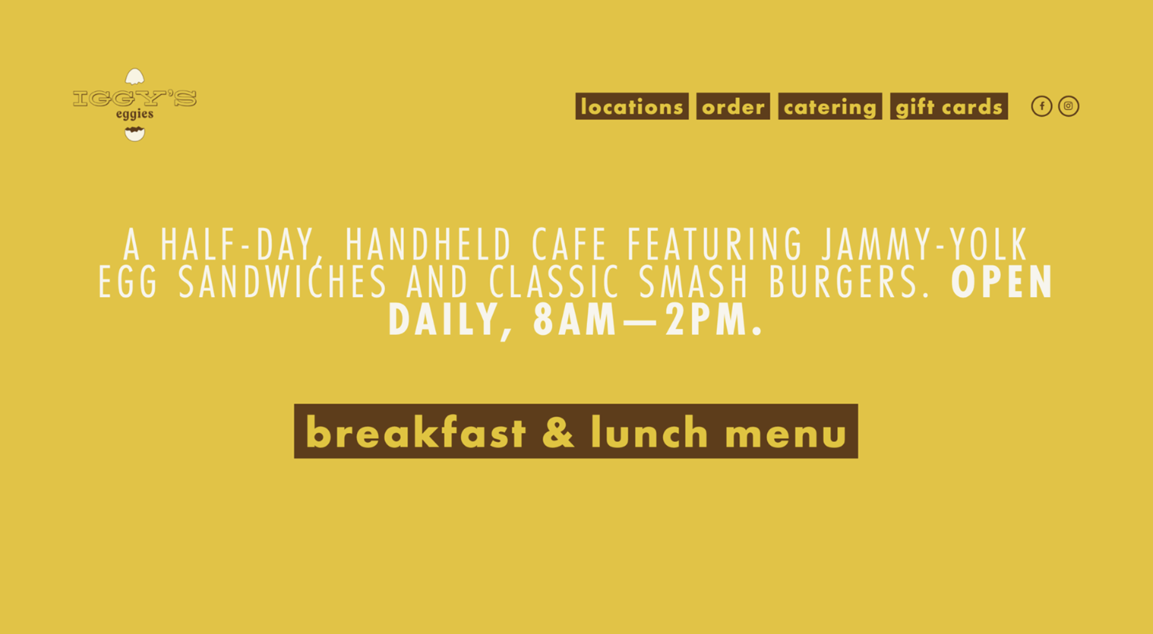
The current Iggy's Eggies website features this home page and tabs for locations, ordering, catering, and gift cards. Next to the tabs, there are links to the company's social media. The homepage features a place to view their menu.
Project Type 💻
Personal Project
Timeline ⏰
September 2024 (1 Month)
How it started...
This project was originally a case study provided by a marketing student organization that I'm a part of on campus (Michigan Advertising and Marketing). The task was to create a design deliverable that would help Iggy's Eggies, a new Ann Arbor food business, attract more student customers. I decided to use UX as my design medium and explore what changes could be made to Iggy's online website to help its marketing efforts. This exercise helped me truly explore how business goals and marketing intersect with design.
Evaluating the site...
I started off by evaluating the current Iggy's Eggies website for potential places where the design of the website could be improved, keeping the 10 usability heuristics in mind. Here's what I noticed.
🟧 Unaccessible Color Scheme:
After running the site through the accessibility validator, WAVE, I noticed that some parts of the original site didn't have the appropriate color contrast. This is especially a problem for the white text and the yellow background.
🟧 Colors Scheme Mismatch:
I noticed that the color scheme on the website and on the picture from the logo didn't match the signage outside of the store which could potentially lead to problems with brand recognition.
🟧 External Sites:
When users navigate to the order tab to view the menu, the website redirects them to an external site to order. This could cause potential confusion to the customers because the only way to view the menu is by clicking on the button on the homepage, but this common action could warrant its own tab.
🟧 No Pictures:
Another thing that I noticed about the site is that there are no pictures of the actual "eggies" on both the site and the external order site. This could be a problem because food is often an impulse purchase, so not having the pictures there could be a problem when it comes to turning first time site visitors into customers.
🟧 Centralized Website:
When I clicked on the locations tab of the site, I saw that there was an Ann Arbor and a Detroit location, I instinctively clicked on the locations to go to their location specific site, a feature common on the websites of other chain restaurants, but they didn't have one.
User Persona...
After analyzing the site, I interviewed 3 University of Michigan students and asked them questions like:
Have you heard of Iggy's Eggies?
Do you know where their storefront is?
What made you try it/has kept you from trying it?
How often and why do you buy food from cafés in Ann Arbor.
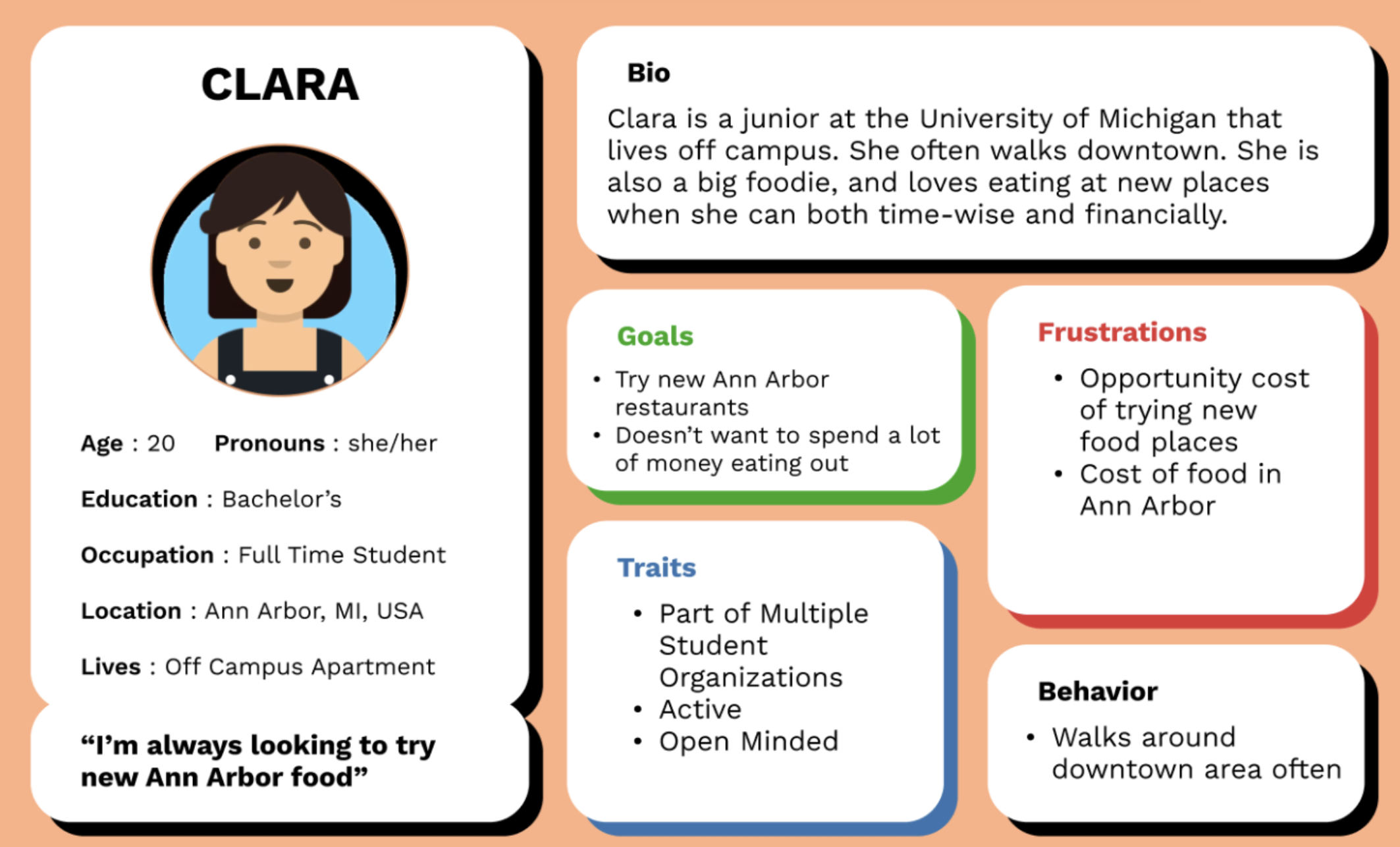
I then used those insights to create a user persona that represents the customer that the business is trying to target.
Design process
How design helps with marketing...
🟨 Focuses on the Target Market for Each Location:
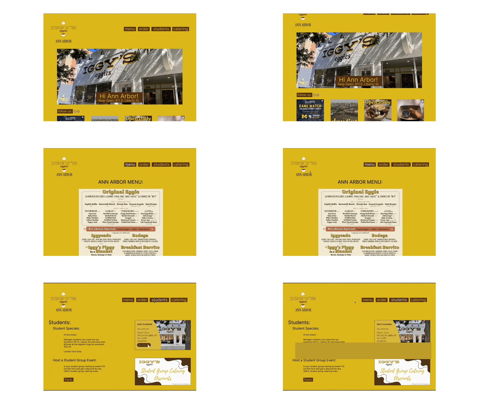
Since the Ann Arbor and Detroit locations both have different target markets, it makes sense for each of them to get their own pages. The Ann Arbor site focuses more on appealing to university students through features such as the Instagram being more prominent on the site and the "Students" tab.
🟨 Takes Advantage of Foot Traffic:
Iggy's Eggies's Ann Arbor restaurant is located extremely close to campus. Many students walk by it on a daily basis because they live in an off-campus apartment or because they are going to another restaurant or store in that area. If a student is walking down this street and gets curious about what Iggy's Eggies is about, it is necessary that the website connects to the storefront as much as possible. Having the picture of the storefront and the address front and center on the page increases the brand recognition.
🟨 Promotes Other Marketing Strategies Through Design:
The "Students" tab dedicates a space of the website to help promote other marketing strategies. When a student is on the Iggy's Eggies website they are more likely to navigate to this tab because it is labeled just for them. Here, there is space for the marketing team to showcase any of their other campaigns that they are running such as student discounts or promotions.
🟨 Drives More Traffic to Social Platforms:
Another change to the site was that previously, the social media icons were small and in the top right corner. However, after taking a looking at the brand's Instagram, I noticed that there were a lot of Ann Arbor specific posts. Additionally, I kept in mind that Instagram is by far the most popular social platform between it and Facebook for college students. Thus, I integrated the Instagram onto the main site so that the posts on the platform are seen by a broader audience. Also, having the Instagram so accessible could also increase more engagement on the platform itself from those who find it from the website.


